Skip to main content
Main navigation
Show — Main navigation
Hide — Main navigation
Articles
Reviews
Travels
Recipes
Projects
The Cookblog
Considered opinions for your amusement
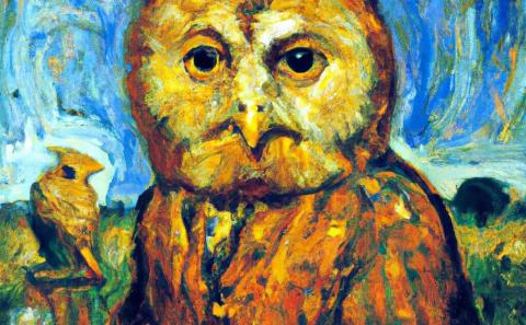
A Peek into the Future with ChatGTP and DALL-E 2
2022 Dec 9
Design
Ethics
Experience
Review
Technology
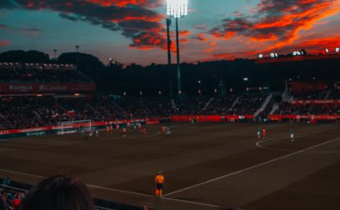
Enjoy World Cup 2022 Responsibly
2022 Oct 12
Ethics
Politics
Soccer
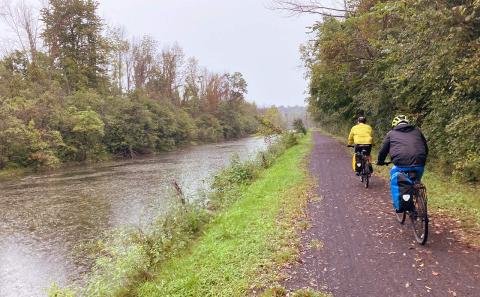
Cycling the Erie Canal
2022 Sep 20
Cycling
Experience
Travel
Overnight Oats
2022 Jul 20
Sweet